Menu
Menu
Choosing your wedding colors is not simply a matter of preference or trend it is the beginning of a story. Colors speak, they evoke memories, they create emotion, and above all, they establish harmony between people and place. In the world of luxury weddings in Italy, where beauty is never superficial and every detail carries meaning, the color palette is a poetic language that must respect and celebrate the venue in which the wedding lives. Too often, wedding design is guided only by seasonal trends, Pinterest boards, or the fashion of the moment. But true artistry begins when design listens before it speaks—when the venue, the landscape, the architecture, the light, and the materials become the first inspiration.

A wedding should never look like a template that could exist anywhere from New York to Paris, from Rome to Los Angeles. A wedding must belong to the place in which it unfolds.
.If your celebration is set in a Renaissance villa in Tuscany, the palette might draw from the patina of aged stone, the silver-green of olive trees, the warm terracotta of the roofs, and the soft gold of the late afternoon light
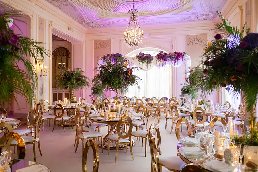
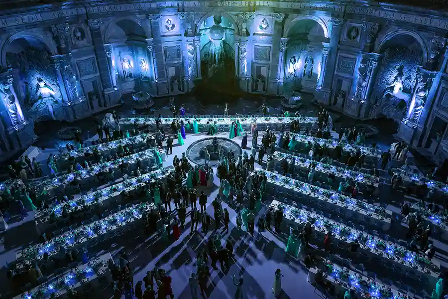
.In Rome, surrounded by marble, frescoes and imperial colours, the palette may call for classical neutrals ivory, champagne, muted gold—balanced with architectural depth.
.In Sicily, where citrus groves glow beneath a Mediterranean sun, bright whites, lemon, soft pistachio and warm earth tones evoke authenticity and heritage.
.In Venice, where lagoon blues, weathered copper and Venetian red reflect centuries of history, colours must feel like water, time, and poetry.
.In Capri, where cliffs plunge into turquoise waters and the sea sparkles under bright white villas, cobalt, aqua and pure white create natural perfection.
.To design without honoring the venue is to design without soul.
.The true purpose of wedding in Italy design is not to impose aesthetics but to reveal the beauty already present in the place chosen to celebrate love.

Limit the palette to two to four core colors, with the support of neutrals that allow the environment to breathe. A single main color explored in multiple shades can be more powerful than five competing tones. Elegance lives in restraint.

Texture builds dimension matte and gloss, linen and silk, wood and glass, smooth and sculpted. Even a monochrome palette becomes extraordinary when layers of material create rhythm and depth. Texture is where design moves from decoration to experience.

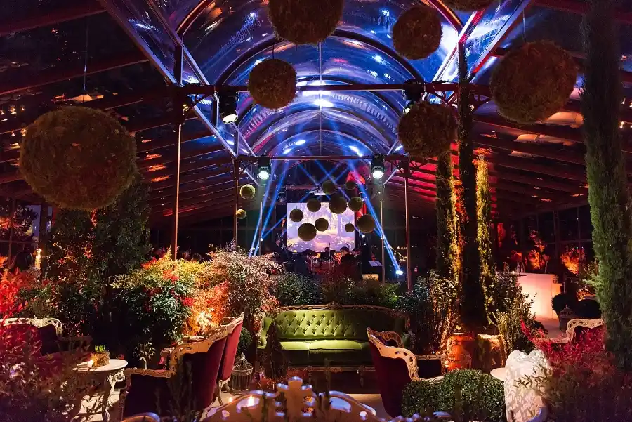
Flowers, foliage and natural elements should reflect what the earth offers in that region and season. Some colors, such as vivid blues, rarely exist naturally in blooms reserve them for textiles, paper goods or lighting, allowing floral design to remain truthful and timeless.

Certain combinations carry strong identity: red, white and green evoke an Italian flag; burgundy and dark green recall Christmas. Creativity is not forbidden just refined. Shift to lighter or darker shades, soften with neutrals, and transform symbolism into elegance.

Luxury is not excess—it is coherence. A wedding becomes extraordinary when architecture, palette, materials, light, sound, scent and emotion align into a single harmonious composition.This is our philosophy:
Design must always begin with listening: listening to the venue, to the landscape, to the history, and to the couple’s story. Only then can we create an event that is authentic, immersive, unforgettable, and truly impossible to replicate.

.Does your palette respect and reflect the venue?
.Does it harmonize with the architecture, natural light, landscape and materials?
.Is the number of colors balanced and intentional?
.Have you considered textures as carefully as hues?
.Does the palette tell your story, not a trend’s story?
.Could this wedding exist only in this place, and nowhere else?
Whether you dream of a villa overlooking the rolling hills of Tuscany, an imperial palace in Rome, a seaside estate in Capri, a baroque garden in Sicily or a magical celebration in Venice, we create wedding designs that honour the place, reflect your identity and elevate every detail into a meaningful experience. Your wedding deserves to live in harmony with its surroundings. Your colors should not decorate the venue they should reveal its soul.


